Creating a series of designs - 28/10/2022
Creating a series of designs
Daisy Jackson / 28/10/2022
This week I set myself the ongoing task of creating designs and bringing my ideas to life.
I will more than likely spend next week (or half of next week) doing the same thing as I want the perfect designs to communicate Warhorse the story in my own way.
Here are my designs:
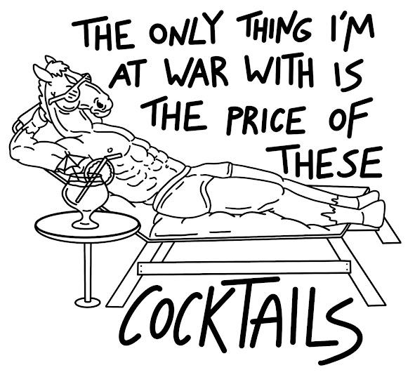
I really love this design as it communicates Warhorse in a unique way. It is a fun midpoint design where it references Warhorse but can also just be a general shirt for people to wear and enjoy. From my survey I noticed that a large amount of individuals were not familiar with the story or Warhorse at all, so creating a mid-way shirt would be great to generate sales but also reference Warhorse.
The second image was a try out for a different design for the deck chair. I decided to go with the top one as this made the design less complicated and not too overcrowded. Perhaps a development point I could create for this design would be adding money floating around Warhorse?
'Peter the horse is here' is a well known Family Guy reference that many of a younger audience will understand. This also can cacth the interest of Family Guy friends. The first design communicates Joey's name but the second design brings both Joey and Topthorn into the design which I do love. I think this design is really interesting and captures the humour that I want to in my work.
This design communicates how much Joey sold for in auction which was £40. This is an important element of the story and something I wanted to communicate. I tried a range of different designs but personally, I am drawn to the last design which says 'priceless' on the tag. Despite not communicating how much he was sold for, it does indicate that Joey was sold in auction. This design differs to the second as the hole for the tag made it look like it said 'pricelesso' which i did not like. This would be a fun design for cards, T-shirts, tote bags ane prints.
I love these designs for the cards as they communicate love and don't overcomplicate anything. This would be more aimed towards Warhorse fans however, it is clearly indicated that Joey and Topthorn are the ones on the card. I have even put them in order of when mentioned so Topthorn is on the left and Joey is on the right.
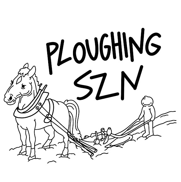
This design will definitely be changed to become more child friendly. However, I still wanted to play around with the words and try the design out. This could possibly be something I could sell in my own time to a wider range of audience. I will still keep this design but come back to it to make it more appropriate.
31/10/2022
MAKING ADJUSTMENTS TO DESIGNS:
Because this is supposed to be a family friendly fair, I decided to edit the inappropriate design and change it to 'ploughing season' as this still communicates an important part of the story. I did an alternative of 'SZN' rather than 'season' to try this out. 'Szn' is an abbreviation commonly used by the younger generation so I wanted to see if this looked good or not. It did not hit the same so I decided to choose 'ploughing season' as my final design for this concept.
What I love about these designs is that anyone can wear them despite not knowing the storyline of Warhorse. It communicates important aspects but at the same time, also shows a design that can interest a range of parties. I wanted to do this as the results in my survey did say that a few of the participants were not familiar with the story or the film Warhorse.


Comments
Post a Comment